
How to Edit a Terminal Order Screen Layout #2
The order screen on the terminal can be edited right where it lives — tabs, sections, speed rails, and buttons — and you see the real screen change as you edit it. There’s no separate preview and no trip through the back office.
A manager can add and arrange tabs, sections, speed rails, and buttons, rename them, recolour them, give them icons, and drag them into order. Button sizes can be tuned and saved for the whole store or for just one terminal.
Where to find it
Open an order, tap Tools, and Edit Layout is at the bottom left of the Tools panel.
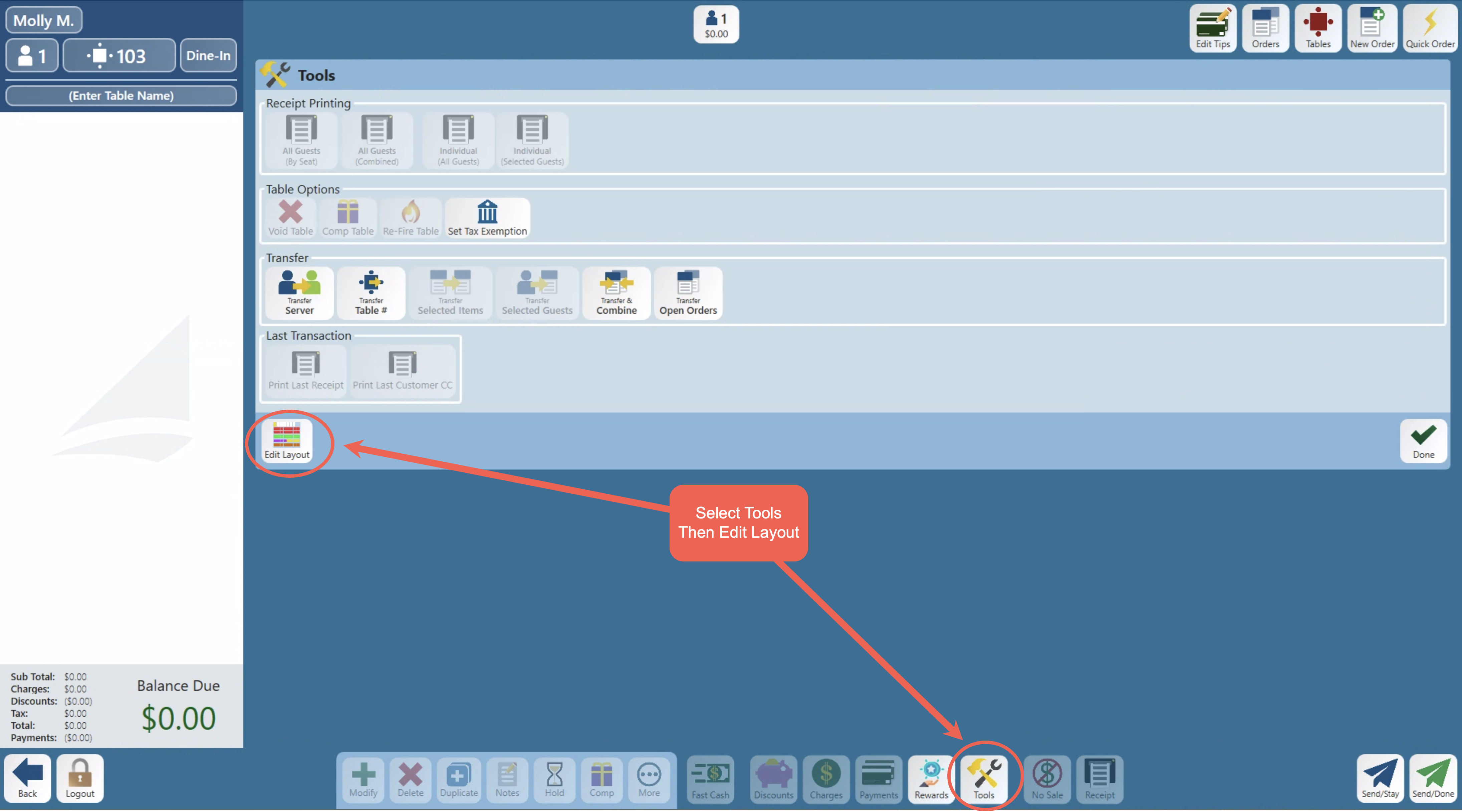
If you don’t see it, you might need permissions. Edit Layout only appears for job roles with the Manage Terminal Screens job role task — the same permission that already controls the back office’s Terminal Setup page. If your job role doesn’t have it, the button simply isn’t there — it hides itself.
Getting in and what you see when it opens
- On the order screen, tap Tools, then Edit Layout.
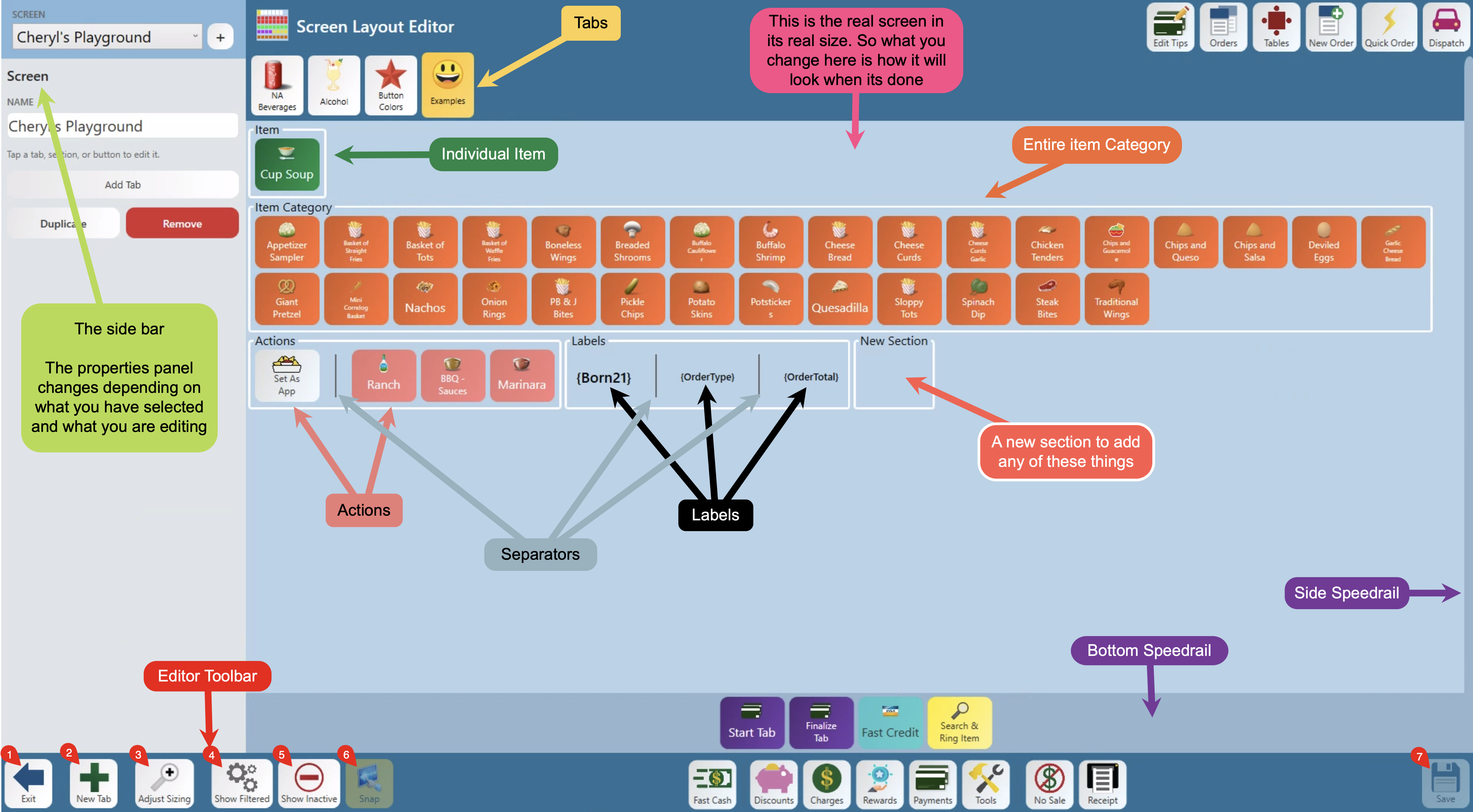
- The order screen stays where it is — the sidebar switches to the editor, prompting “Tap a tab, section, or button to edit it.”
- Make your changes. Nothing is saved until you tap Save.
What you’ll see:
Leaving the editor
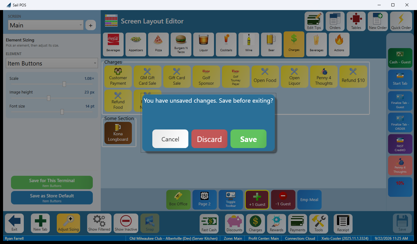
Use the Exit button to leave the editor. If you try to leave with unsaved work, you’ll be asked: “You have unsaved changes. Save before exiting?” — Cancel, Discard, or Save. When you exit, you’re returned to the screen you were editing, on the tab you were looking at.
What you can add to a screen
Select a tab or a section and the sidebar shows what you can add to it — the choices differ depending on where you're adding.
Whatever you add, its properties panel ends with the same three controls: Active (hides it from the floor without deleting it), Duplicate (makes a copy of it, right where it sits, so you can tweak the copy instead of building one from scratch), and Remove (deletes it for good)
Adding a new tab
A tab is a page of the screen. There are two way to add a new tab.
- With the screen itself selected, use Add Tab from the bottom toolbar to add one to the end
- or select an existing tab and use Add Tab → to insert a new one right after it.
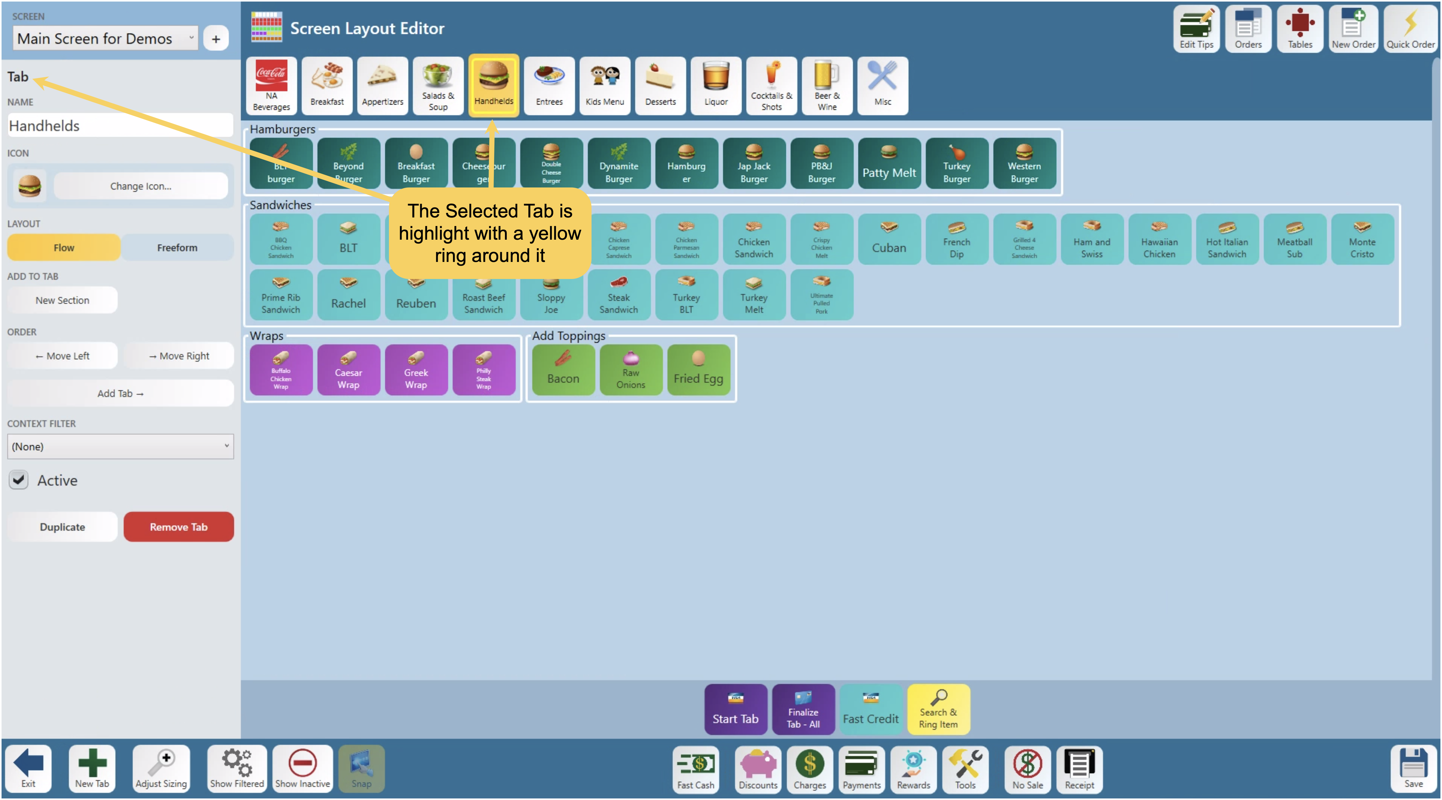
A tab’s properties panel offers:
- Name - This allows you to rename the selected tab
- Icon - Add or change the icon
- Layout - Choose between Flow or Freeform layout — To learn more see Flow vs. Freeform, below
- Add to Tab - Show you what you can put on this tab. and changes based on the selected layout
- Order - set with ← Move Left / → Move Right
- Context Filter — attaches one of your context filters, so the tab only appears when that filter allows it
- Plus the usual Active, Duplicate, and Remove.
Removing a tab warns first: “Remove {name} and all of its buttons?”
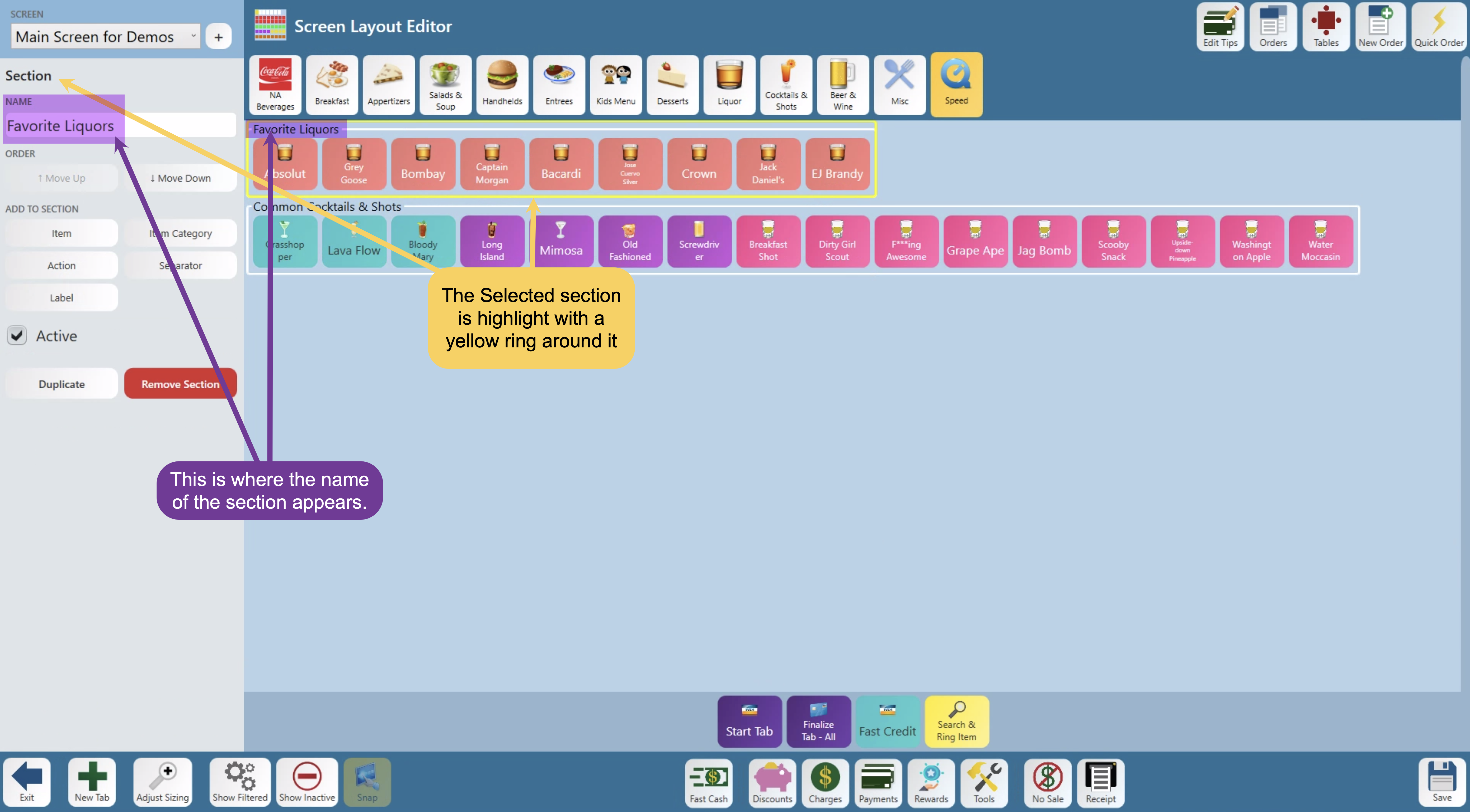
Adding a section
A section is a named box of buttons within a tab. To add a new section select a tab along the top and choose New Section. A section can be left empty on purpose — it stays that way through a save.
A section’s properties panel offers:
- Name - Rename the section
- Order - Only appears if you are in the flow layout, and allows you to ↑ Move Up / ↓ Move Down the selected section
- Add to Section - This is what you can put in this section
- Plus the usual Active, Duplicate, and Remove.
Removing a section warns first: “Remove {name} and all of its buttons?”
Adding an item
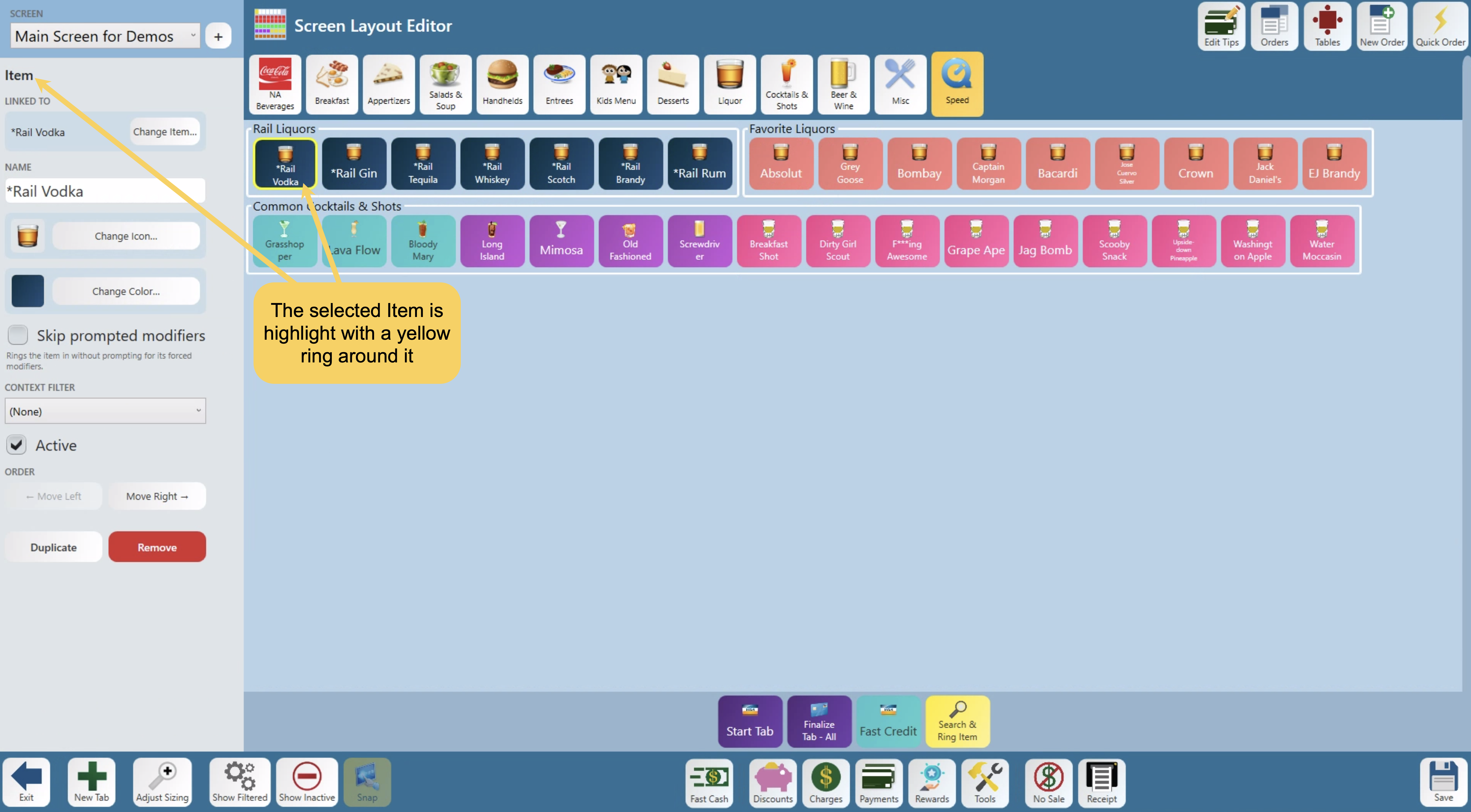
An item’s properties panel offers:
- Linked to — What the button points at. Change Item… repoints it without rebuilding the button
- Name — What the button says. It defaults to what the button is named in backoffice, but can be overridden here. If you do change it a Default button will appear to put it back to the item’s own name
- Icon — It defaults to the icon that is selected in backoffice, but can be overridden here. Change Icon… opens the picker; double-tap an icon to choose it, or Clear to remove it
- Color — Change Color… allows you to change the buttons color
- Skip prompted modifiers — rings the item in without prompting for its forced modifiers
- Context Filter - attaches one of your context filters, so the item only appears when that filter allows it
- Order - Only appears if you are in the flow layout, and allows you to move the button right or left within the section
- Plus the usual Active, Duplicate, and Remove.
Adding an item category
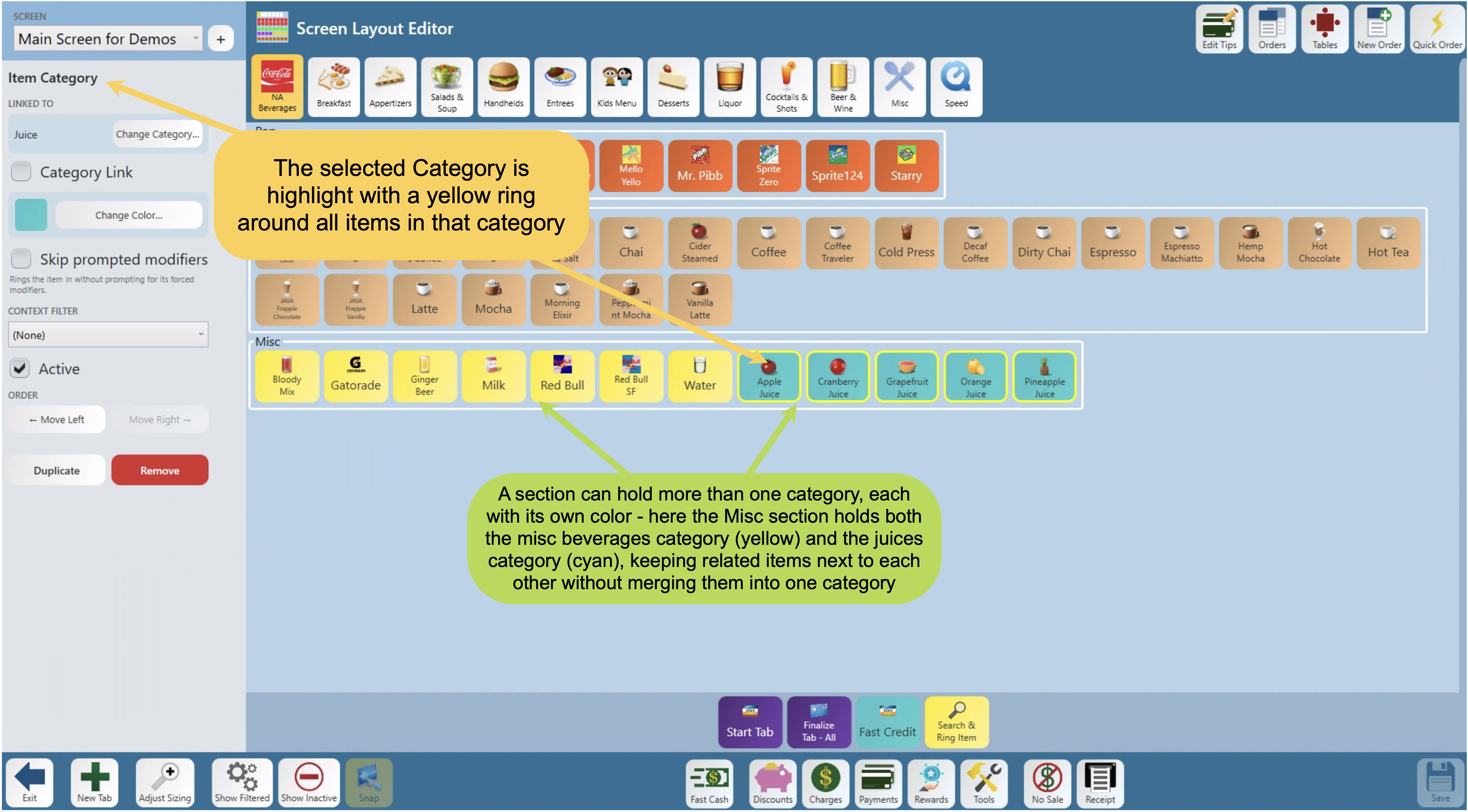
An item category button opens a category of items.
An item category’s properties panel offers:
- Linked to — What category this points at. Change Category... repoints it without rebuilding the section
- Category Link - When selected the whole category becomes one button and is a link that will open the entire category.
- Color - Change Color… allows you to change the whole categories color
- Skip prompted modifiers - ALL items in this category will ring the item in without prompting for its forced modifiers
- Context Filter - attaches one of your context filters, so the category only appears when that filter allows it
- Order - Only appears if you are in the flow layout, and allows you to move the category right or left within the section
- Plus the usual Active, Duplicate, and Remove.
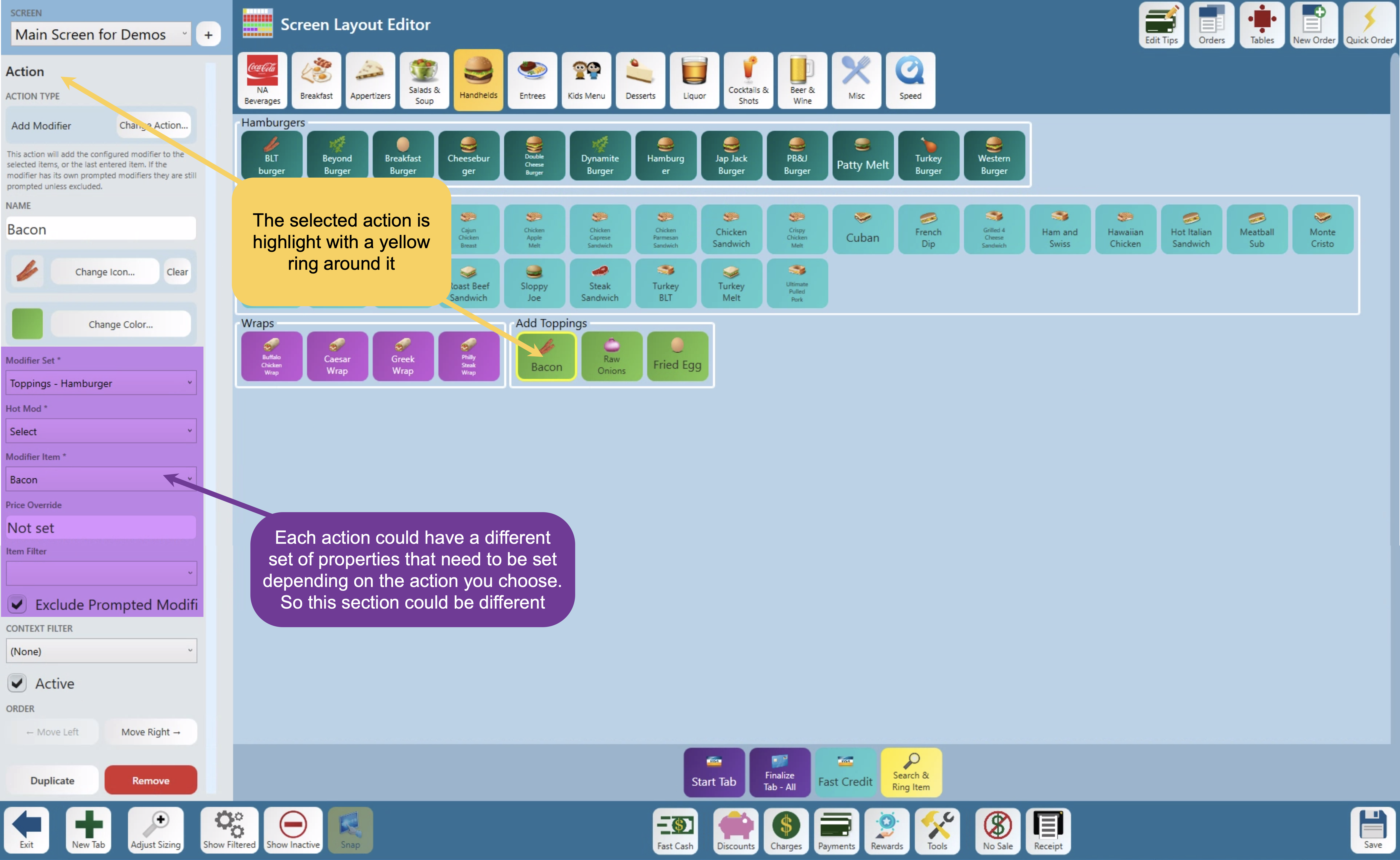
Adding an action
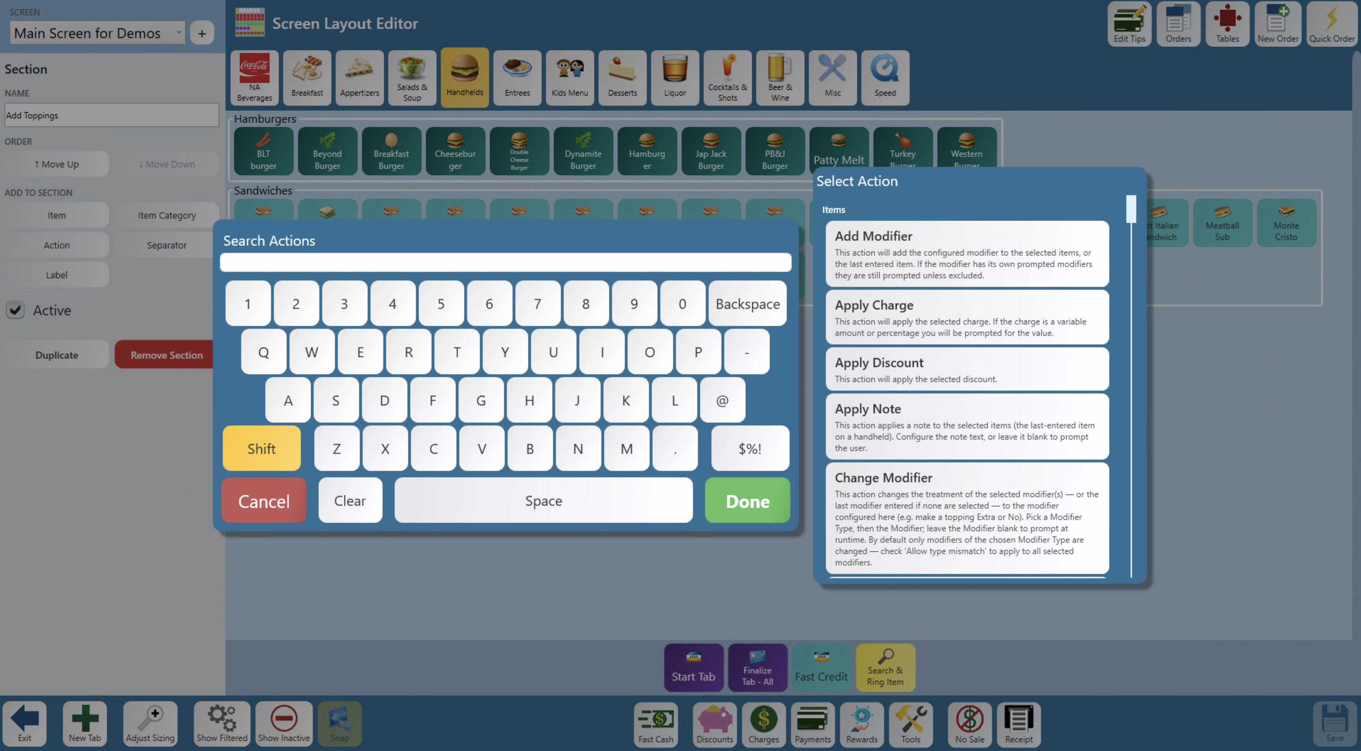
- Action type — What the button points at. Change Action… repoints it without rebuilding the button, alongside a sentence or two explaining what the current action does
- Name — What the button says. It defaults to what the action is named, but can be overridden here.
- Icon — It defaults to the icon that is associated with that action, but can be overridden here. Change Icon… opens the picker; double-tap an icon to choose it, or Clear to remove it
- Color — Change Color… allows you to change the buttons color
- Action Settings - Then that action’s own settings, appended underneath — and these are different for nearly every action, since each one needs something different configured. Adjust Guest Count, for example, adds just two fields, Adjustment and Amount; Add Modifier, shown below, adds six completely different ones — Modifier Set, Hot Mod, Modifier Item, Price Override, Item Filter, and Exclude Prompted Modifiers
- Context Filter - attaches one of your context filters, so the action only appears when that filter allows it
- Order - Only appears if you are in the flow layout, and allows you to move the button right or left within the section
- Plus the usual Active, Duplicate, and Remove.
Adding a separator
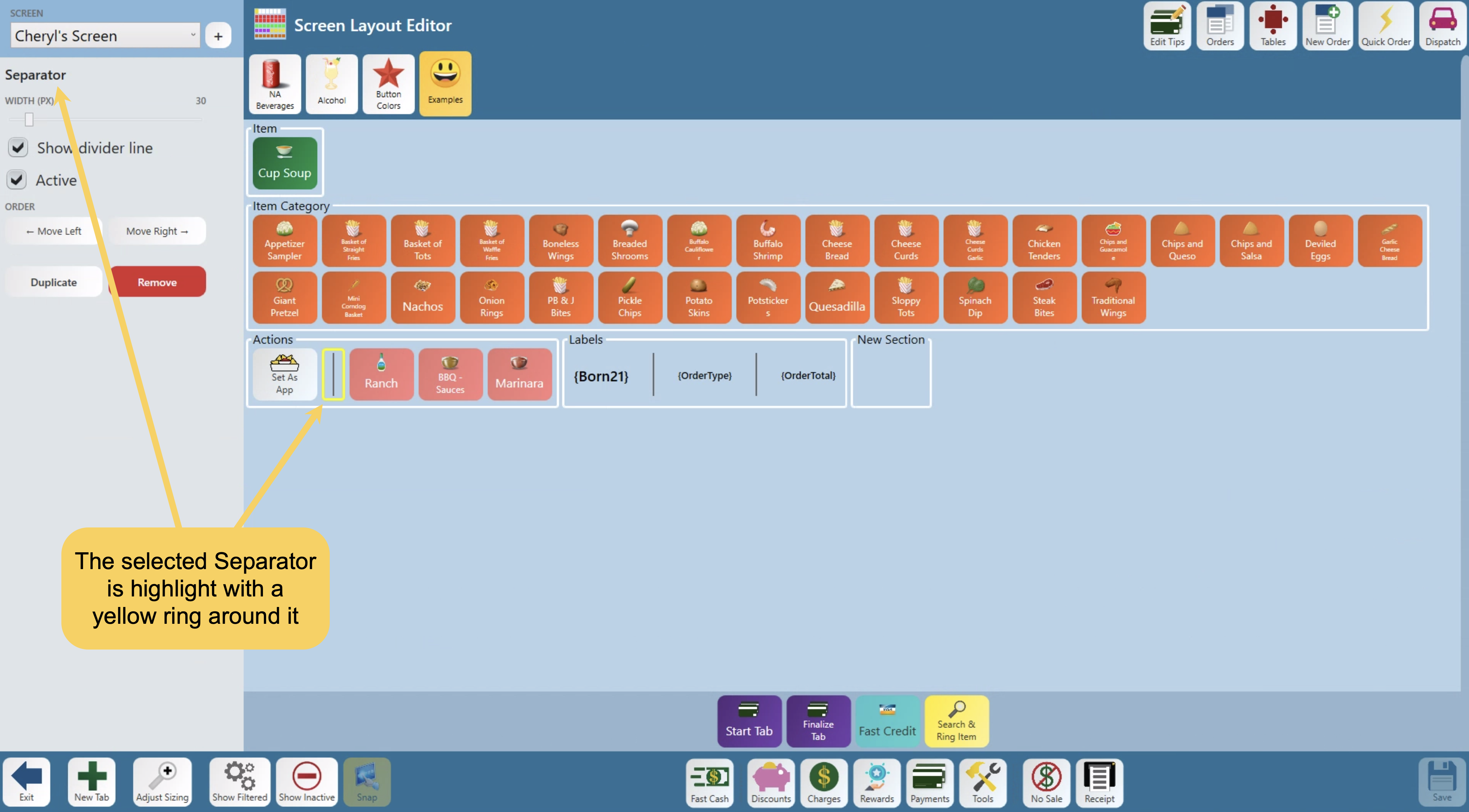
A separator is a divider — but only inside a section or speedrail
A separator’s properties panel offers:
- Width (px) — a slider that sets how wide the gap is. From 5 - 250px
- Show divider line — whether it draws a line or is just a gap
- Order - allows you to move the button right or left within the section
- Plus the usual Duplicate, and Remove.
Adding a label
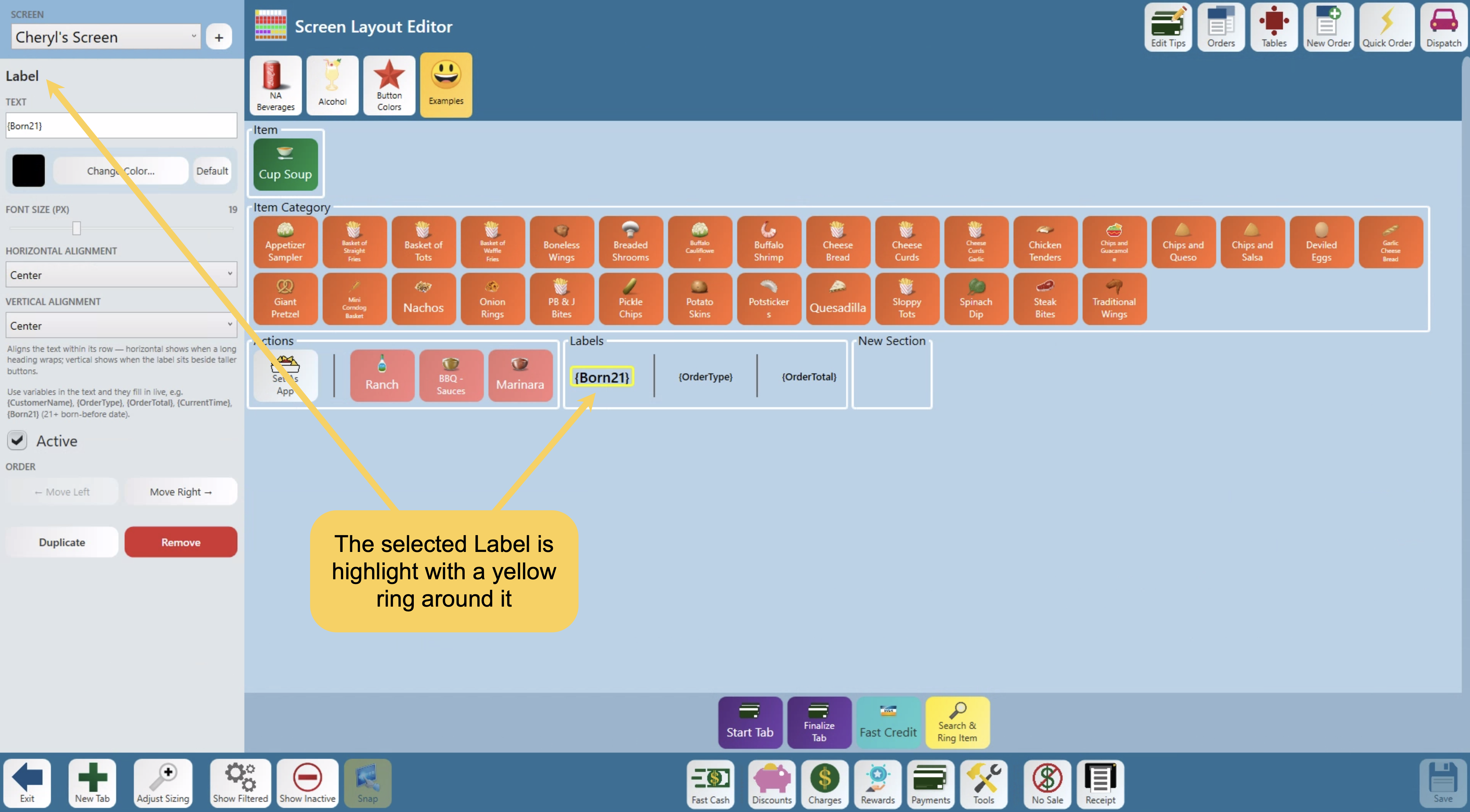
A label is static text, useful for titling an area. There’s nothing to pick — it’s added directly.
A label’s properties panel offers:
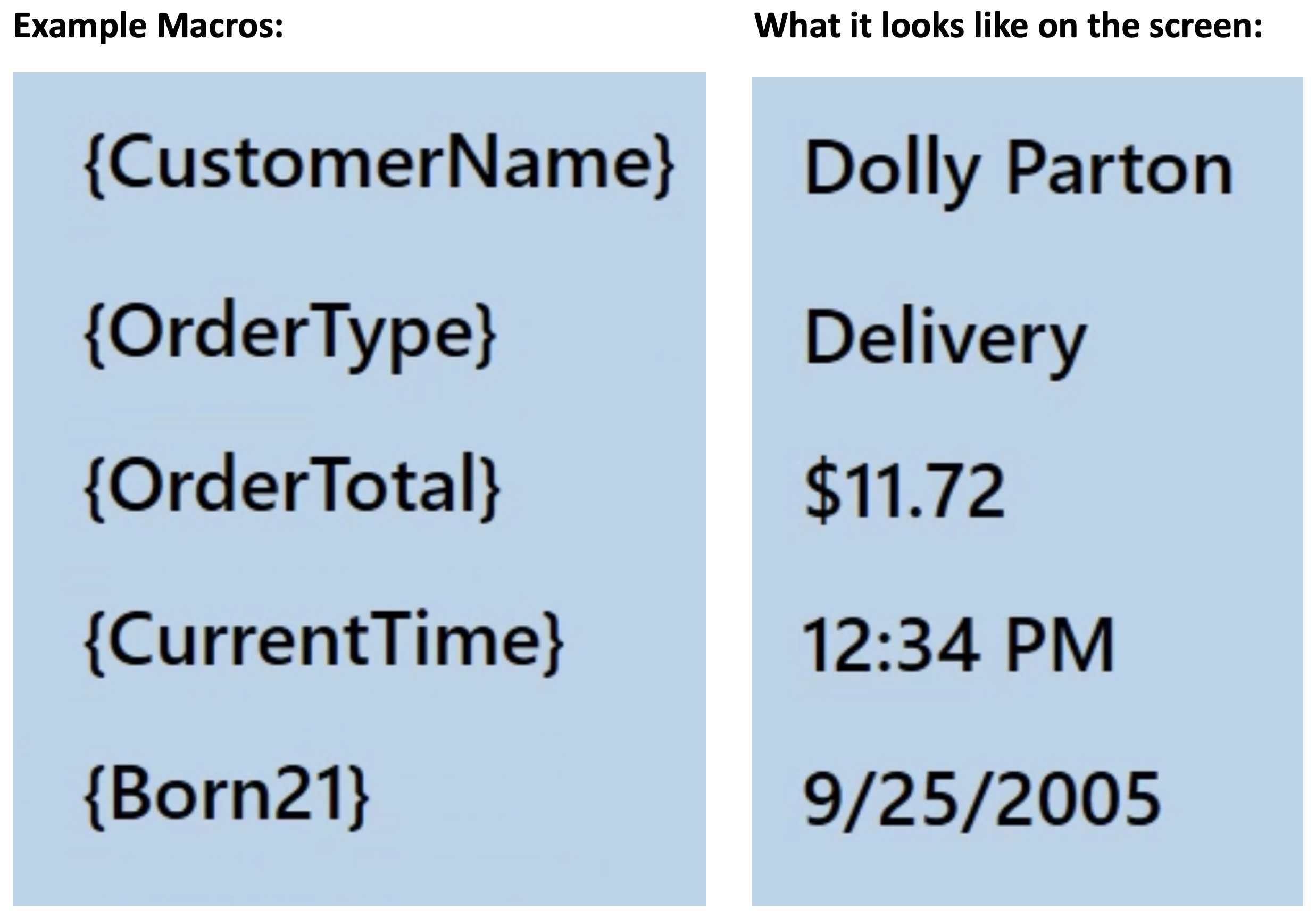
- Text — the text it displays. You can use variables and they’ll fill in live — for example
{CustomerName},{OrderType},{OrderTotal},{CurrentTime}, or{Born21}are macros that can be use to display that information on the screen - Color — Change Color… allows you to change the color of the text. With a Default button to reset it to black
- Font size (px) — a slider from 10-40px that allows you to change the size of the text
- Horizontal alignment and Vertical alignment — Only appears in you have the label inside a section. It will align the text within its row; horizontal shows when a long heading wraps, vertical shows when the label sits beside taller buttons
- Order - Only appears in you have the label inside a section and allows you to move the label to the right or left within the section
- Plus the usual Active, Duplicate, and Remove.
Flow vs. Freeform
Every tab is laid out one of two ways, switched from the tab’s properties:
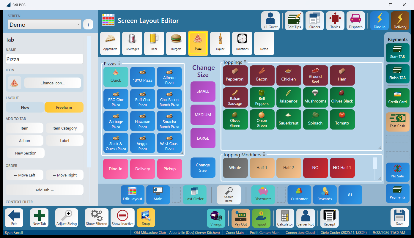
Switching to Freeform asks: “Switch this tab to Freeform layout? You’ll be able to drag buttons and section boxes anywhere.”
Switching back to Flow asks: “Switch this tab back to Flow layout? The freeform positions on this tab will be cleared.”
Going back to Flow throws away your Freeform positions, and there’s no undo. If you’re experimenting with a Freeform layout, duplicate the screen first so you have something to fall back on.
Snap, on the editor toolbar, is a Freeform-only aid — it snaps a dragged button to a 5-pixel grid so a row lines up cleanly. It’s greyed out on a Flow tab, and it isn’t saved with the screen; it just helps while you’re dragging.
Making a new screen
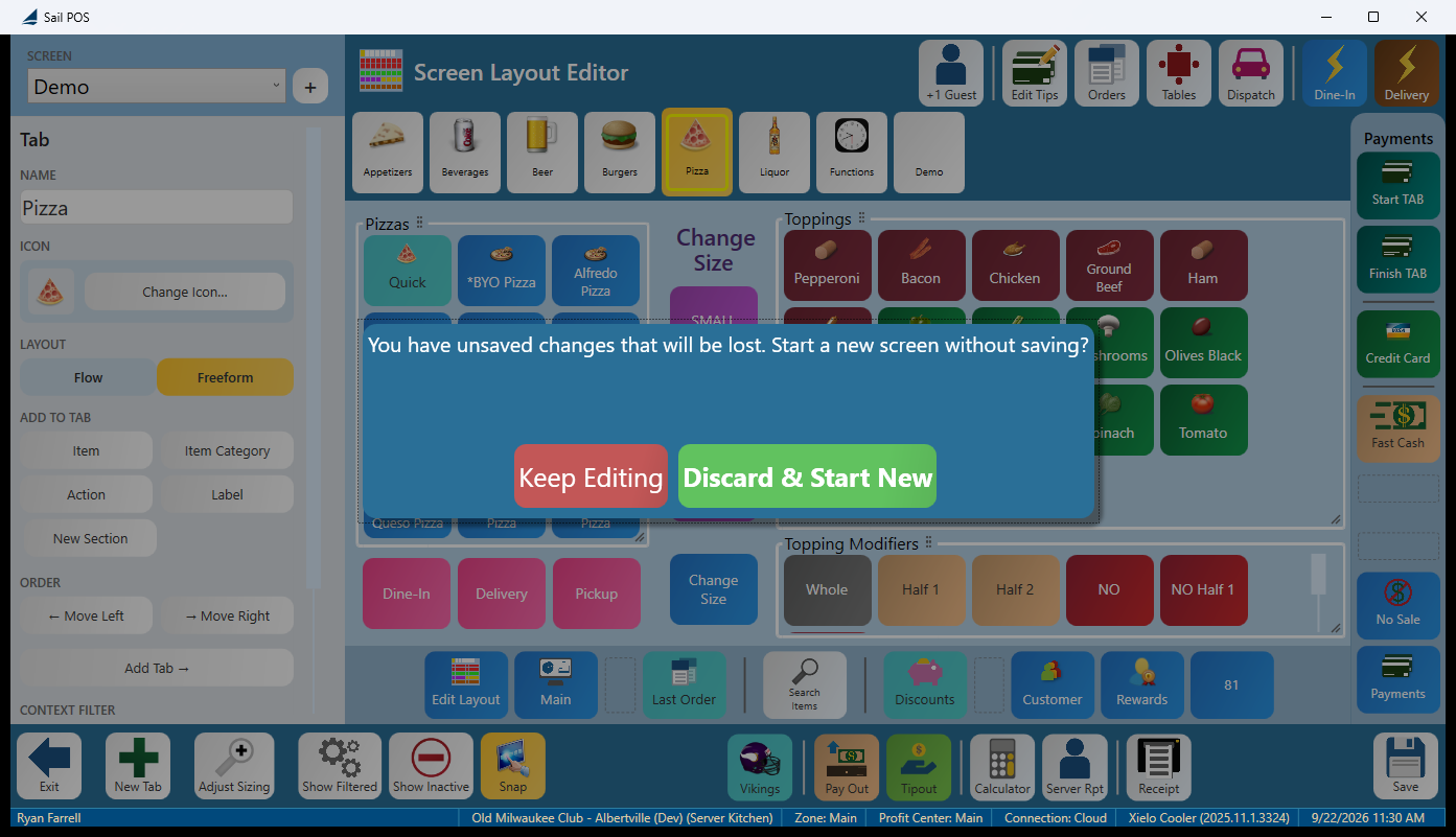
- New Screen — the + beside the screen picker. If you have unsaved work, you’ll be asked first: “You have unsaved changes that will be lost. Start a new screen without saving?” (Keep Editing / Discard & Start New.)
- Duplicate Screen — makes a copy to work from.
- Remove Screen — has one hard stop: “This is the terminal’s default screen and can’t be removed here.”
Sizing — store default vs. this terminal
Adjust Sizing on the editor toolbar switches the sidebar to Element Sizing: “Pick an element, then adjust its size.”
You size a kind of element at a time, not one individual button. An ELEMENT dropdown picks what you’re sizing (Item Buttons, and the other element types), and three sliders control it: Scale (for example 1.00× to 1.25×), Image height in pixels, and Font size in points. The screen behind you redraws as you drag, so you’re sizing against the real layout rather than a preview.
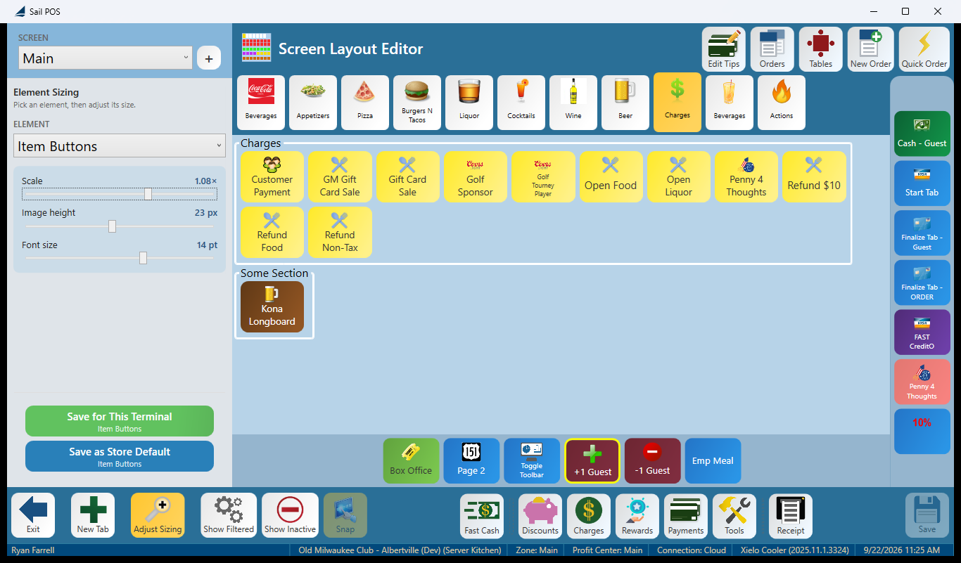
- Save as Store Default — every terminal in the store gets this size, unless it has its own override.
- Save for This Terminal — only this terminal. Useful when one terminal needs a different size than the rest.
The prompt asks plainly: “Save the button sizing to the store default (all terminals) or just this terminal?”
A terminal override always wins over the store default — so a store-wide size change won’t reach a terminal that already has its own saved size. To undo an override, use Use Store Default, which warns: “This terminal’s saved size for it will be removed.” This is the single most confusing part of sizing, so it’s worth remembering: if a store-wide resize doesn’t seem to be taking effect on one terminal, check whether that terminal has its own saved size.
FAQ
I don’t see Edit Layout on my terminal. It only appears for job roles with the Manage Terminal Screens permission — the same one that controls Terminal Setup in the back office. The button hides itself rather than showing an error, so check the job role’s permissions first.
I switched a tab back to Flow and lost all my positions. Freeform positions are cleared when a tab goes back to Flow — the prompt warns before it happens, and there’s no undo. If you’re experimenting, duplicate the screen first.
Tools → Edit Layout opened the wrong thing. The launcher’s Tools screen has its own Edit Layout button that opens the table/floor plan editor — a different feature. The screen editor’s Edit Layout is on the order screen’s Tools panel, bottom left.
Why can’t I add a Print Terminal Report button? Print Terminal Report and Distribute Tip Pool are both temporarily unavailable to add in this release. Existing buttons that already use them still work.
Does editing a screen change anything already rung in? No. A screen is just a layout — changing it changes what the terminal shows from the next save onward. No order, receipt, or report is affected.
What if I leave in the middle of editing? Nothing is saved until you tap Save, and leaving always asks first — Save, Discard, or Keep Editing.