
How to Edit the Terminal Order Screen Layout
The order screen on the terminal can now be edited right where it lives — tabs, sections, speed rails, and buttons — and you see the real screen change as you edit it. There’s no separate preview and no trip through the back office.
An Owner/Manager can add and arrange tabs, sections, speed rails, and buttons, rename them, recolour them, give them icons, and drag them into order. Button sizes can be tuned and saved for the whole store or for just one terminal.
Permission needed
You need Manage Terminal Screens — the same permission that already controls the back office’s Terminal Setup page. There’s nothing to turn on; the permission is the whole gate. If your job role doesn’t have it, the Edit Layout button simply isn’t there — it hides itself rather than showing an error.
Where to find it
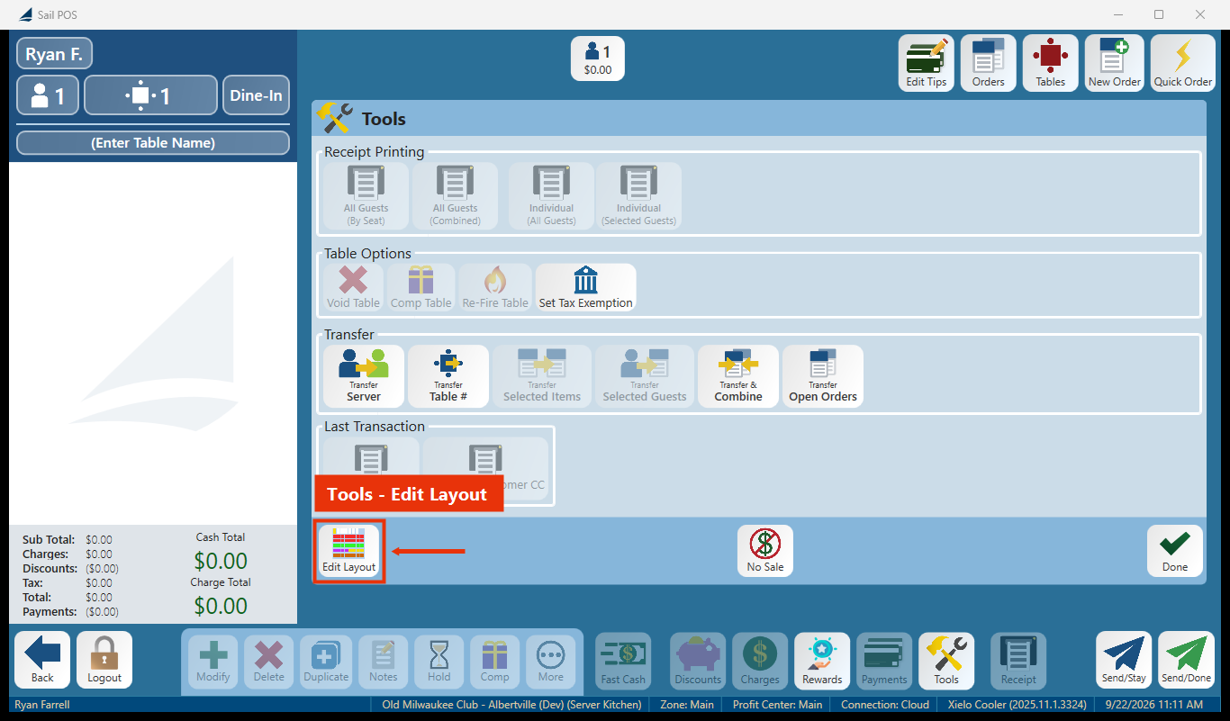
Open an order, tap Tools, and Edit Layout is at the bottom left of the Tools panel, beside No Sale. That’s the route that’s always there, so it’s the one to learn.
A store can also put an “open the editor” button anywhere else on a screen — a rail, a tab, the bottom row — since opening the editor is itself just one of the actions a button can run. Because a store places and names that button itself, its caption can vary, so don’t expect it to say “Edit Layout” in a specific spot. Tools → Edit Layout always works.
Careful with the other “Edit Layout.” The launcher’s Tools screen has a different button also called Edit Layout — that one opens the table/floor plan editor, not this screen editor. If you land in a floor plan instead of your buttons, you tapped the wrong one.
Getting in and out
- On the order screen, tap Tools, then Edit Layout (bottom left of the Tools panel).
- The order screen stays where it is — the sidebar switches to the editor, prompting “Tap a tab, section, or button to edit it.”
- Make your changes. Nothing is saved until you tap Save.
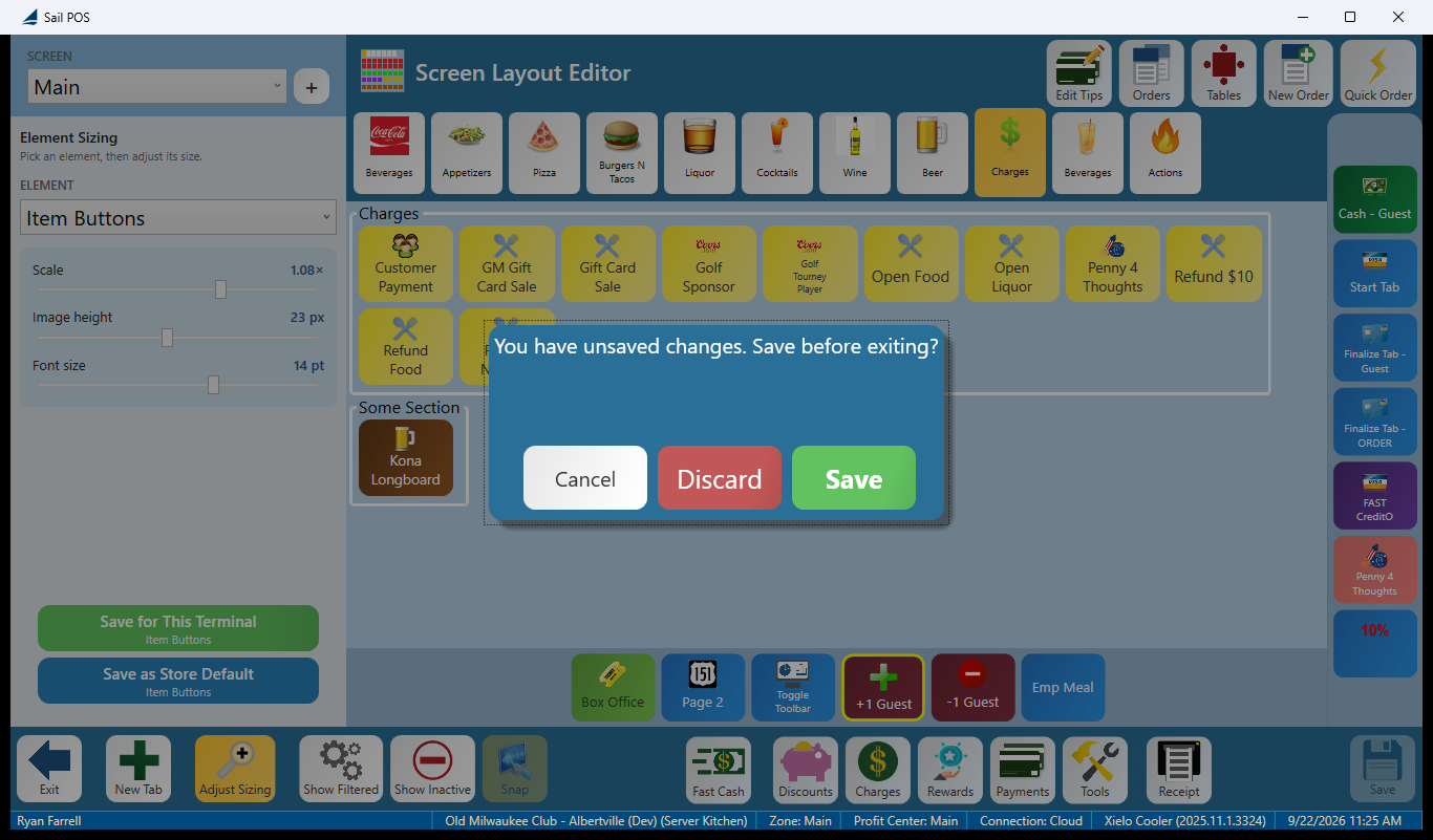
- If you try to leave with unsaved work, you’ll be asked: “You have unsaved changes. Save before exiting?” — Cancel, Discard, or Save.
- When you exit, you’re returned to the screen you were editing, on the tab you were looking at.
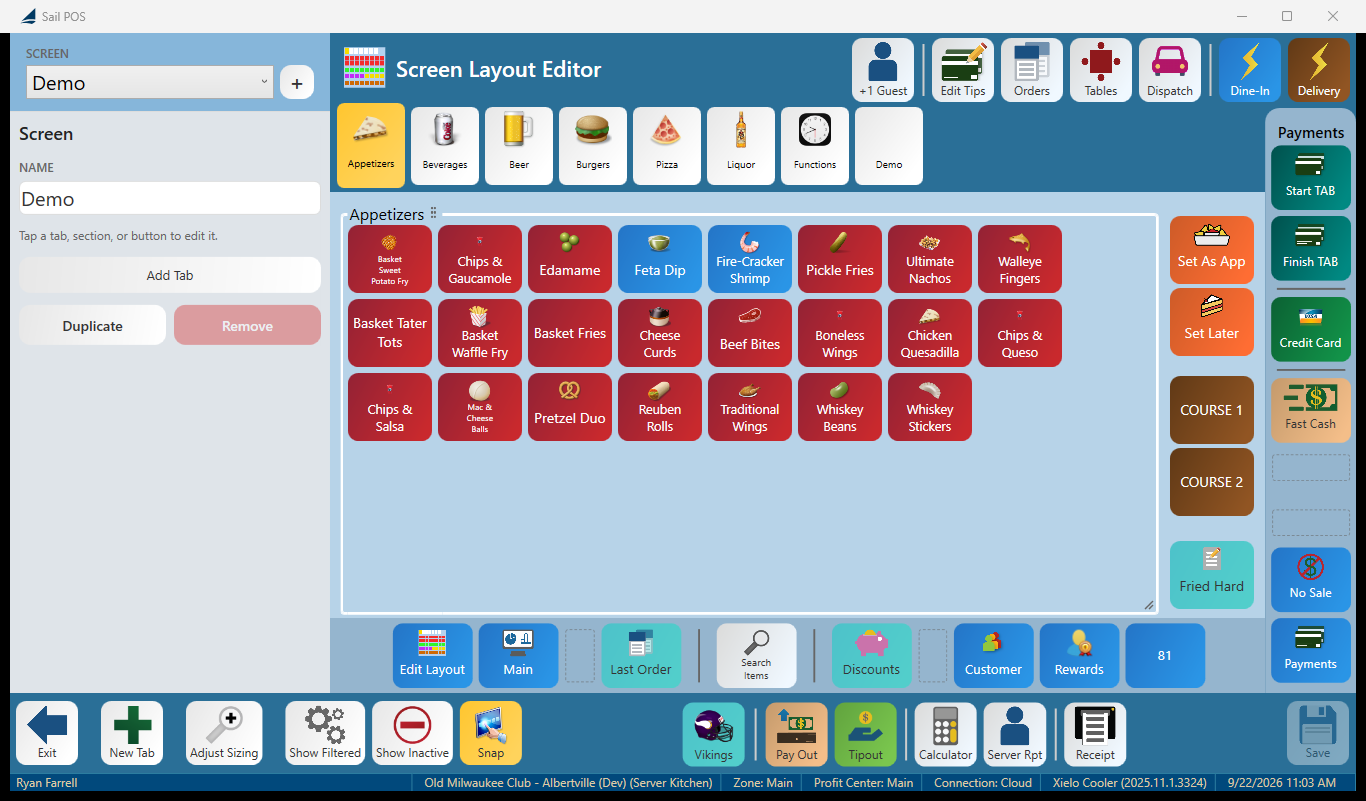
What you’ll see when it opens:
What you can add to a screen
Select a tab or a section and the sidebar shows what you can add to it — the choices differ depending on where you’re adding.
Adding to a section: Item, Item Category, Action, Separator, Label.
Adding to a tab: Item, Item Category, Action, Label, New Section.
- Item — rings in a menu item. Pick several at once and you’ll get a button for each. Requires an item search (modifiers aren’t offered).
- Item Category — opens a category of items. A tickbox in its properties can turn it into a Category Link instead. Requires a category search.
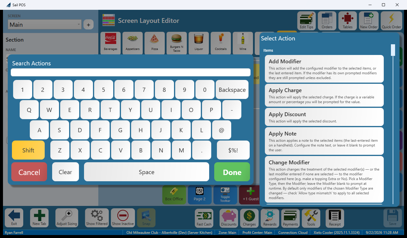
- Action — runs one of the POS actions (Payments, Discounts, Tools, Time Clock, transfers, and more). Requires picking from the Select Action dialog.
- Label — static text, for titling an area. Nothing to pick.
- Separator — a divider, but only inside a section; it isn’t offered at the tab level. If you try to add one at the tab level, you’ll see: “A separator can only be added inside a section. Add or select a section first.”
Choosing an action opens Select Action — a search box with an on-screen keyboard on the left and the catalogue on the right, grouped by type, with a plain-English description under every action. For example, Apply Note: “This action applies a note to the selected items (the last-entered item on a handheld). Configure the note text, or leave it blank to prompt the user.”
Two actions are temporarily unavailable to add: Print Terminal Report and Distribute Tip Pool aren’t offered in any picker right now. Buttons that already run them keep working — they just can’t be added new.
The four things you arrange
- Tab — a page of the screen. You can Add Tab, Add Tab → (after the selected one), rename it, move it with ← Move Left / → Move Right, or Remove Tab.
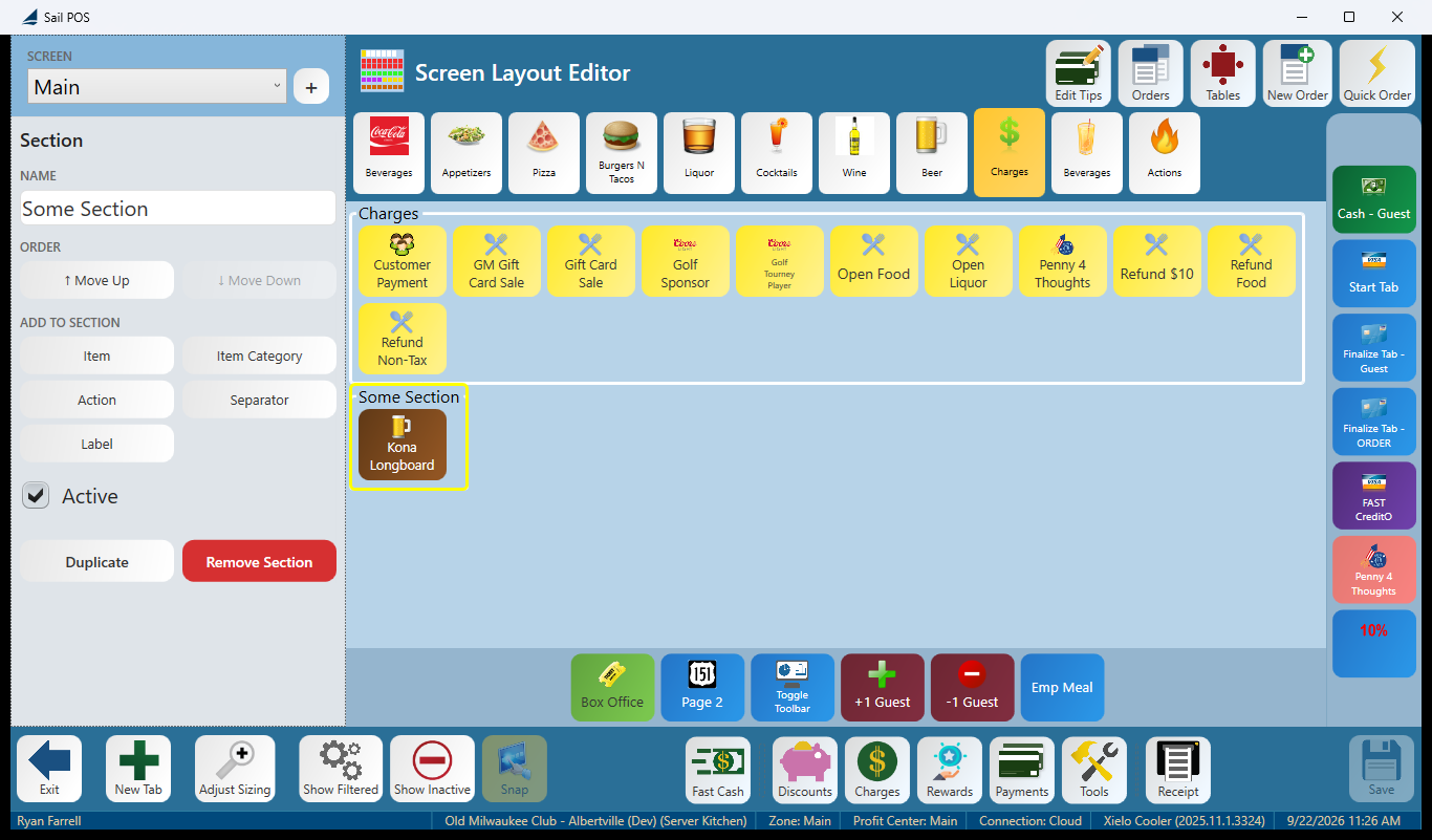
- Section — a named box of buttons within a tab. You can create one with New Section, rename it, move it, or Remove Section. A section can be left empty on purpose and stays that way through a save.
- Speed rail — the strips down the side and along the bottom for buttons you reach for constantly. You can add buttons to it or Remove Speed Rail. An empty rail collapses to a thin strip you can still select.
- Bottom order toolbar — the button row under the order screen. Tap a button to edit it, tap the empty bar to select the toolbar itself, and drag to reorder, add, or remove buttons.
Removing any of these warns you first: “Remove {name} and all of its buttons?”
The properties panel
The panel changes with whatever you select, and its heading names what that is — Item, Item Category, Action, Section, Tab, Screen.
- Item — Linked to (Change Item…), Name, icon, colour, Skip prompted modifiers, Context Filter, Active, Order, Duplicate, Remove.
- Item Category — Linked to (Change Category…), a Category Link tickbox, colour, Skip prompted modifiers, Context Filter, Active, Order, Duplicate, Remove. There’s no Name field — it uses the category’s own name.
- Action — Action type (Change Action…) with a sentence explaining what that action does, Name, icon, colour, then the action’s own settings (for example, Adjust Guest Count has Adjustment and Amount), and Context Filter.
- Section — Name, Order (Move Up / Move Down), the Add palette, Active, Duplicate, Remove Section.
- Tab — Name, Icon, Layout: Flow / Freeform, the Add palette, Order (Move Left / Move Right), Add Tab →, Context Filter.
- Screen — Name, Add Tab, Duplicate, Remove, and the hint “Tap a tab, section, or button to edit it.”
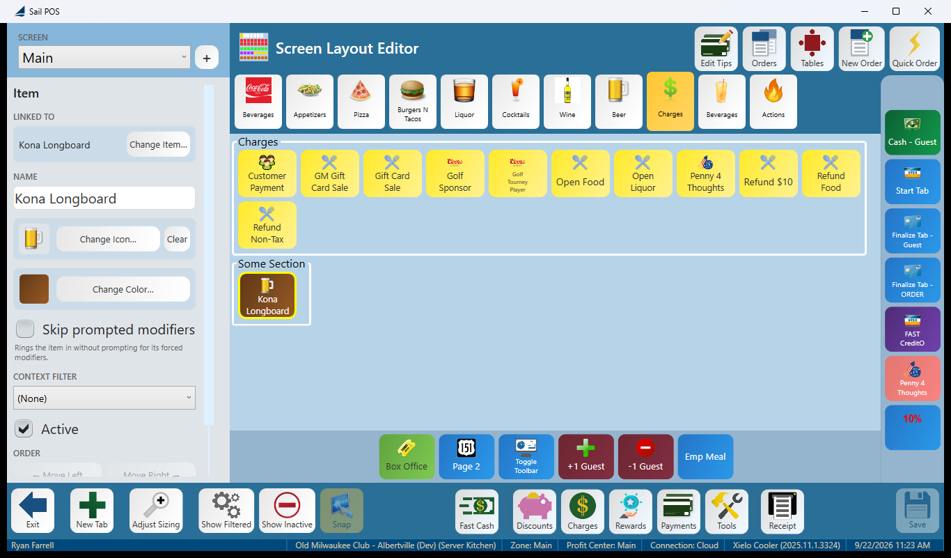
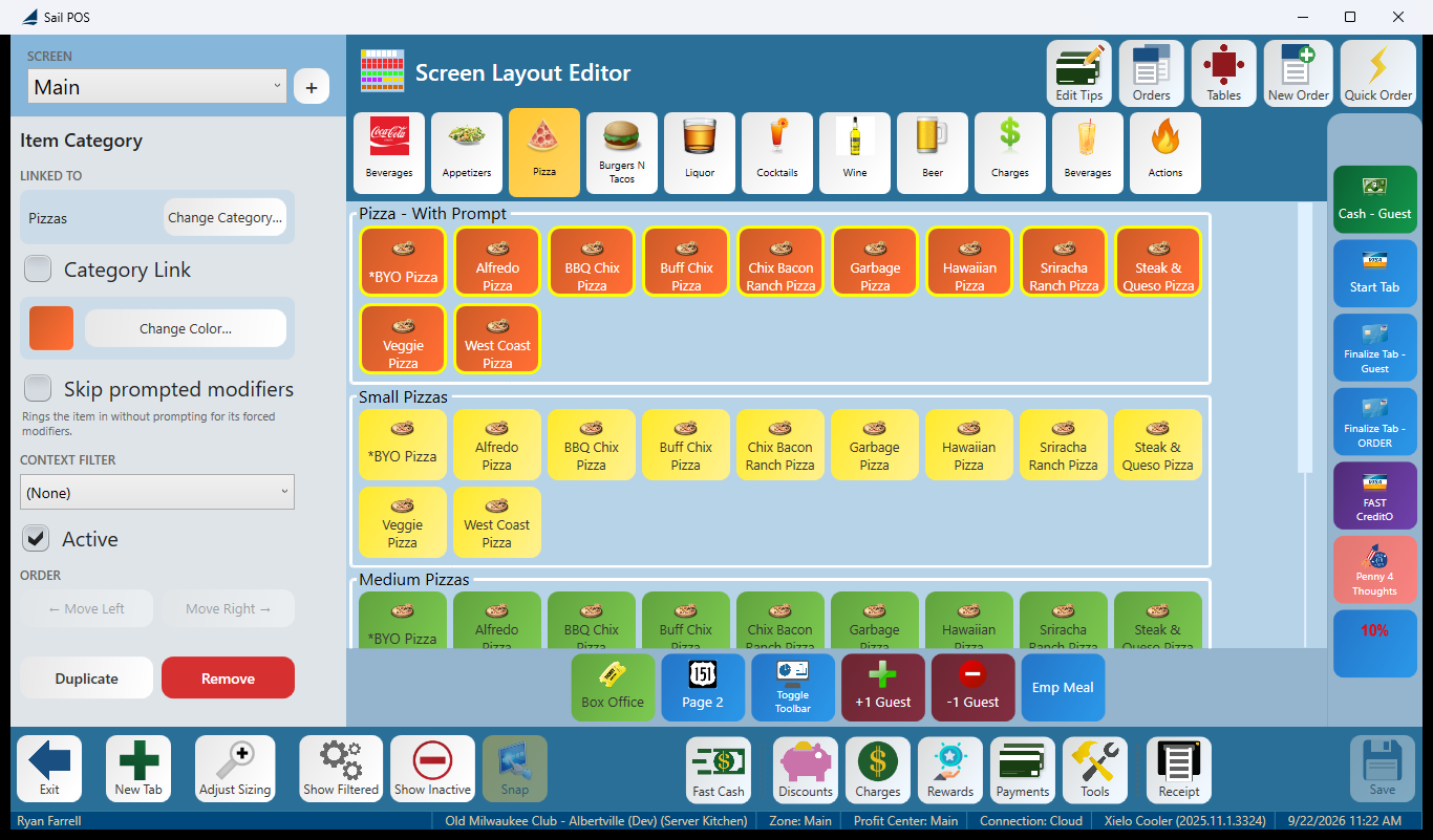
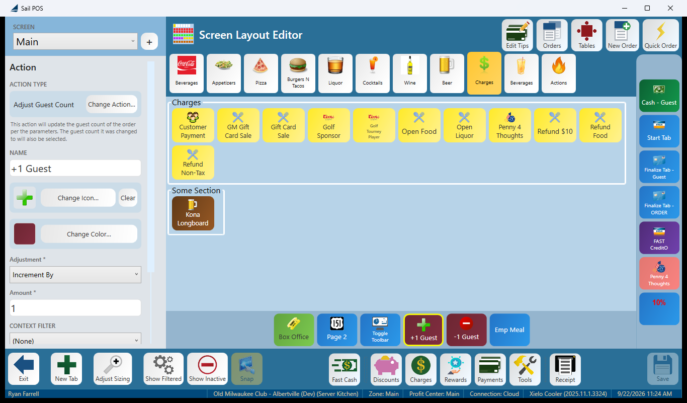
The individual fields, if you need to look one up:
- Name — what the button says. A Default button puts it back to the item’s own name.
- Icon — Change Icon… opens the picker; double-tap an icon to choose it. Clear removes it.
- Colour — Change Colour….
- Active — turning this off hides the button from the floor without deleting it. Hidden buttons stay visible to you in the editor only when Show Inactive is on, shown faded.
- Context Filter — attaches one of your context filters, so the button (or tab) only appears when that filter allows it — for example, a specific store or daypart.
- Order — where the element sits. You can drag it, or use ↑ Move Up / ↓ Move Down / ← Move Left / → Move Right.
- Linked to — what the button points at. Change… repoints it without rebuilding the button.
- Skip prompted modifiers (items only) — “Rings the item in without prompting for its forced modifiers.”
- Show divider line (separators only) — whether the separator draws a line or is just a gap.
- Action type (action buttons only) — which action it runs. Change Action… swaps it, and each action has its own settings underneath.
- Modifier (modifier sets) — how the modifier set behaves when tapped.
- Width, Font size, Horizontal / Vertical alignment — per-element appearance.
Duplicate copies the selected button. Remove deletes it.
Flow vs. Freeform
Every tab is laid out one of two ways, switched from the tab’s properties:
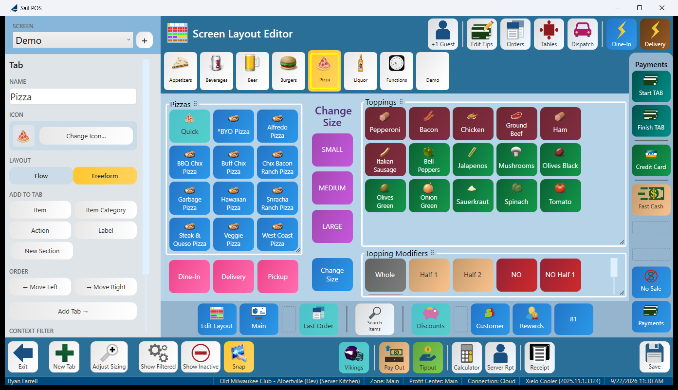
Switching to Freeform asks: “Switch this tab to Freeform layout? You’ll be able to drag buttons and section boxes anywhere.”
Switching back to Flow asks: “Switch this tab back to Flow layout? The freeform positions on this tab will be cleared.”
Going back to Flow throws away your Freeform positions, and there’s no undo. If you’re experimenting with a Freeform layout, duplicate the screen first so you have something to fall back on.
Snap, on the editor toolbar, is a Freeform-only aid — it snaps a dragged button to a 5-pixel grid so a row lines up cleanly. It’s greyed out on a Flow tab, and it isn’t saved with the screen; it just helps while you’re dragging.
Sizing — store default vs. this terminal
Adjust Sizing on the editor toolbar switches the sidebar to Element Sizing: “Pick an element, then adjust its size.”
You size a kind of element at a time, not one individual button. An ELEMENT dropdown picks what you’re sizing (Item Buttons, and the other element types), and three sliders control it: Scale (for example 1.00× to 1.25×), Image height in pixels, and Font size in points. The screen behind you redraws as you drag, so you’re sizing against the real layout rather than a preview.
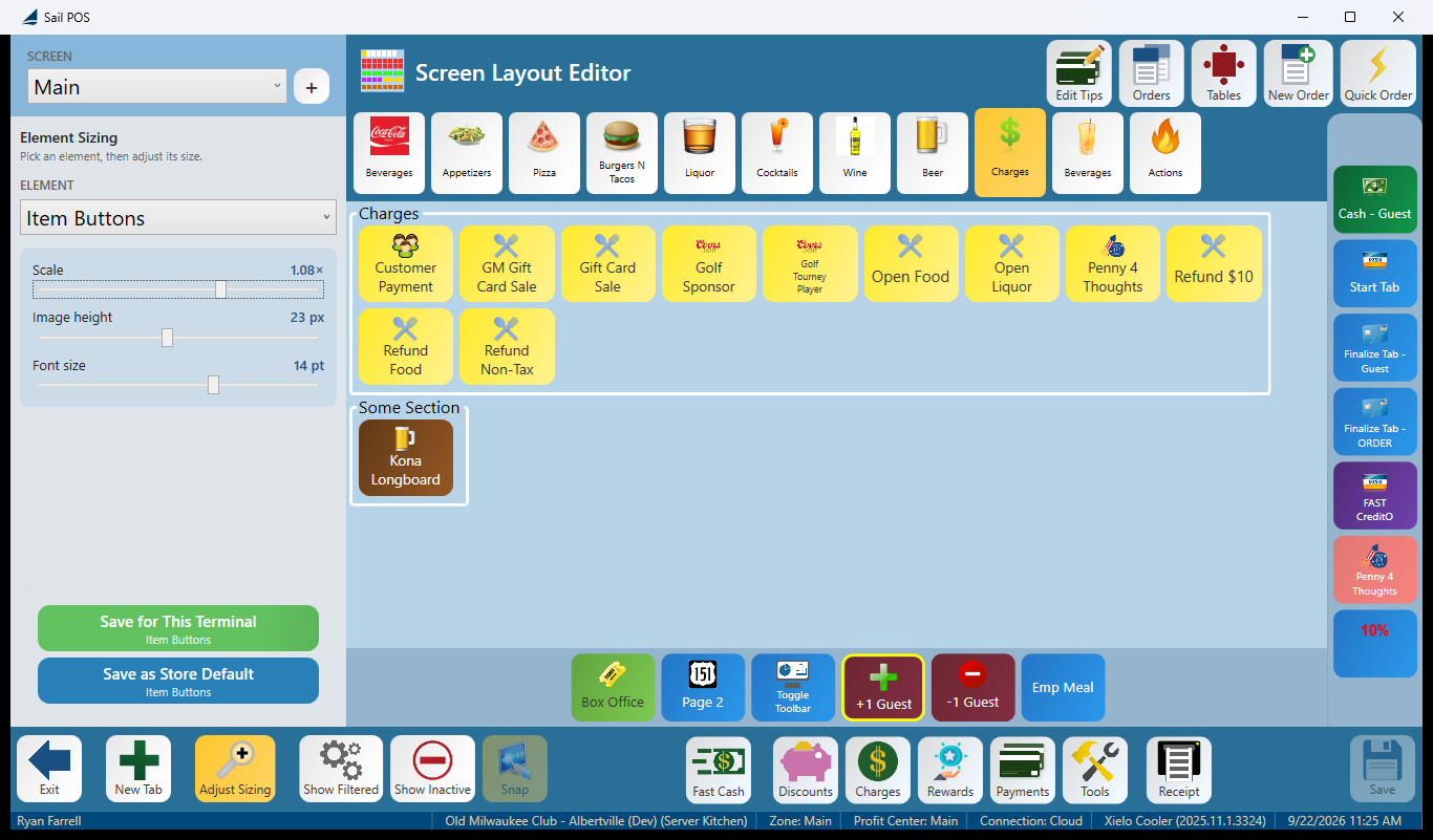
- Save as Store Default — every terminal in the store gets this size, unless it has its own override.
- Save for This Terminal — only this terminal. Useful when one terminal needs a different size than the rest.
The prompt asks plainly: “Save the button sizing to the store default (all terminals) or just this terminal?”
A terminal override always wins over the store default — so a store-wide size change won’t reach a terminal that already has its own saved size. To undo an override, use Use Store Default, which warns: “This terminal’s saved size for it will be removed.” This is the single most confusing part of sizing, so it’s worth remembering: if a store-wide resize doesn’t seem to be taking effect on one terminal, check whether that terminal has its own saved size.
The two preview toggles
Both toggles are off by default and only change what you see in the editor — neither changes what the floor sees.
- Show Inactive — on shows switched-off buttons, faded, so you can edit them. Off, they’re hidden, same as on the floor.
- Show Filtered — on shows buttons and tabs that this screen’s context filters are currently hiding. Off, filters apply normally — what the floor actually sees.
Working with screens
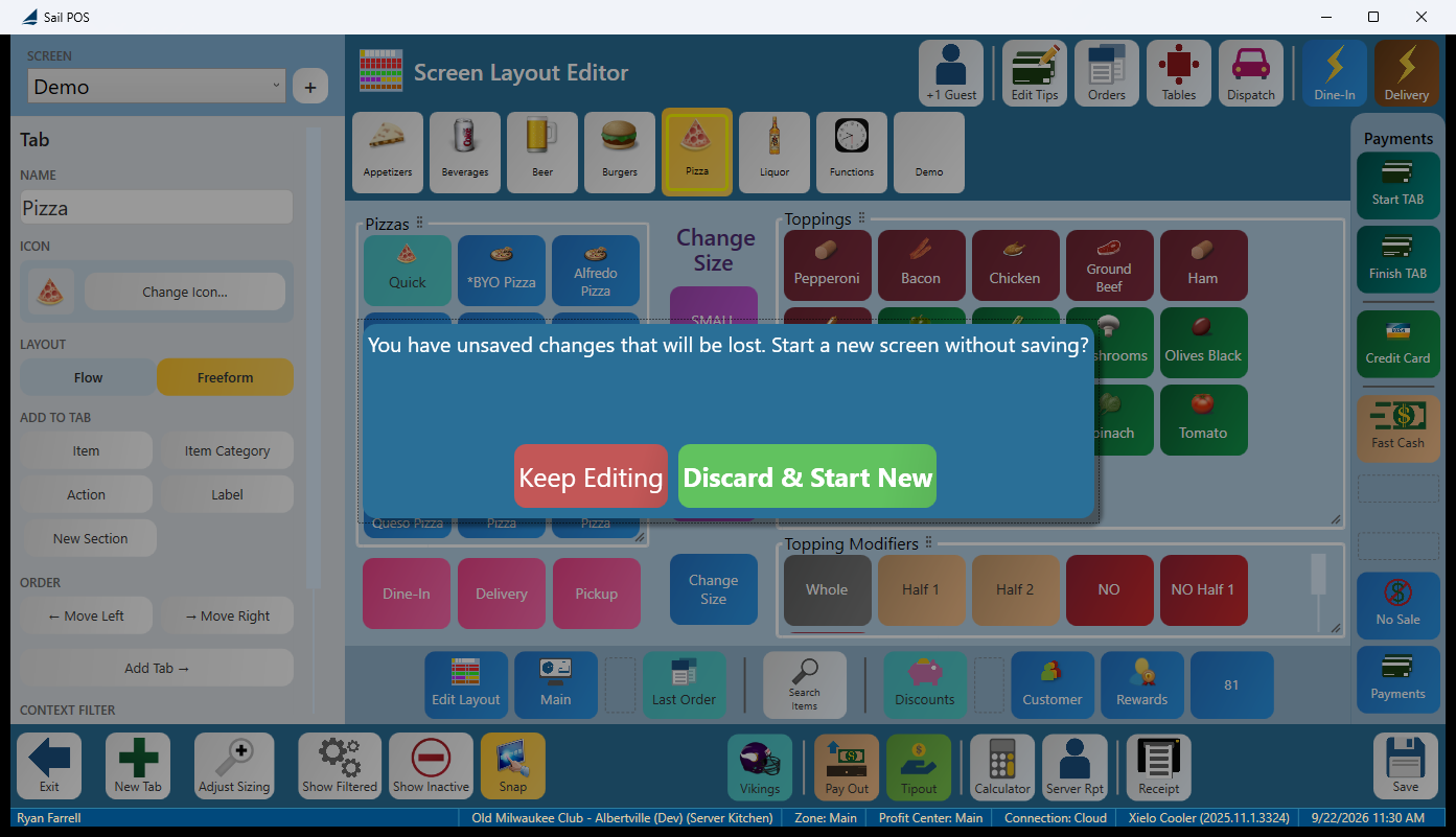
- New Screen — the + beside the screen picker. If you have unsaved work, you’ll be asked first: “You have unsaved changes that will be lost. Start a new screen without saving?” (Keep Editing / Discard & Start New.)
- Duplicate Screen — makes a copy to work from.
- Remove Screen — has one hard stop: “This is the terminal’s default screen and can’t be removed here.”
What the editor won’t let you save
The editor lets you delete any button, including the ones that get you off the screen — so two guard rails stop that from becoming a terminal nobody can use.
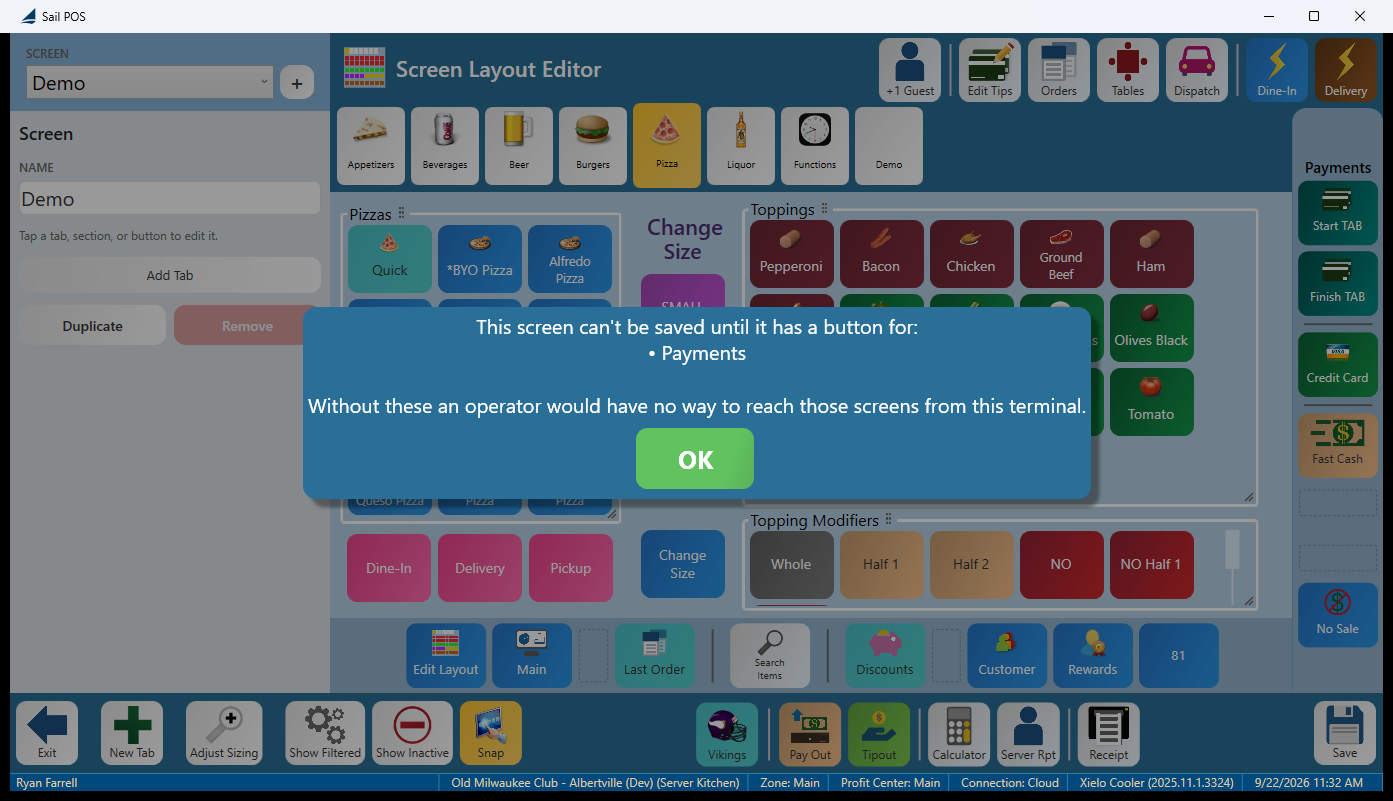
It refuses to save a screen that has no button for Payments, no button for Discounts, or no button for Tools or Layout Editor. The message lists only what’s actually missing — a screen that’s only short a Payments button gets a one-line list:
This screen can’t be saved until it has a button for: • Payments
Without these an operator would have no way to reach those screens from this terminal.
It warns but lets you continue when nothing on the screen reaches Charges:
Nothing on this screen navigates to: • Charges
Save anyway?
What it can’t do yet
- It’s the terminal’s editor only — there’s no equivalent in the customer-facing back office yet.
- Handhelds aren’t covered; TableSide screens aren’t edited here.
- Freeform positions don’t survive a switch back to Flow.
FAQ
I don’t see Edit Layout on my terminal. It only appears for job roles with the Manage Terminal Screens permission — the same one that controls Terminal Setup in the back office. The button hides itself rather than showing an error, so check the job role’s permissions first.
It won’t let me save — it says the screen needs a Payments button. Every screen has to keep a way to reach Payments, Discounts, and Tools (or Layout Editor), or whoever’s on that terminal would have no way out of the screen. Add the missing button and save again. A switched-off button doesn’t count as present.
I switched a tab back to Flow and lost all my positions. Freeform positions are cleared when a tab goes back to Flow — the prompt warns before it happens, and there’s no undo. If you’re experimenting, duplicate the screen first.
Tools → Edit Layout opened the wrong thing. The launcher’s Tools screen has its own Edit Layout button that opens the table/floor plan editor — a different feature. The screen editor’s Edit Layout is on the order screen’s Tools panel, bottom left.
My terminal doesn’t have an Edit Layout button where the guide shows it. Opening the editor is just one of the actions a button can be set to, so a store can place its own anywhere, under any caption. The route that’s always there is Tools → Edit Layout on the order screen.
Why can’t I add a Print Terminal Report button? Print Terminal Report and Distribute Tip Pool are both temporarily unavailable to add in this release. Existing buttons that already use them still work.
Does editing a screen change anything already rung in? No. A screen is just a layout — changing it changes what the terminal shows from the next save onward. No order, receipt, or report is affected.
What if I leave in the middle of editing? Nothing is saved until you tap Save, and leaving always asks first — Save, Discard, or Keep Editing.
No Comments